I remember my first visit to a Tsutaya Books branch—a slightly dim, warehouse-like space with minimal natural light, brown tile floors, and black metal shelving. Alongside the books, rows of rental CDs and DVDs beckoned, but without knowledge of Japanese, navigating them proved challenging. Equally perplexing was signing up for the T-Point Card, a loyalty card that also served as a membership needed for borrowing items.
This experience was a few years before the opening of Daikanyama T-Site in 2011, an event that would stabilise the fortunes of Tsutaya Books' parent company, Culture Convenience Club. Since its founding in 1983 in Osaka, the shop’s core business had centred on rentals. Yet, the growing popularity of online streaming services was putting increasing pressure on the traditional rental market.
Culture Convenience Club took on a new venture with Daikanyama T-Site. Situated on a historic site in the Daikanyama neighbourhood, the complex was designed as a "Library in the Woods" with a campus-like layout. It consists of three interconnected wings, anchored by Magazine Street, a 55-metre-long corridor running through the ground floor. From this central artery, six specialised book departments branch off, each focused on a different category. The site also houses a café and the Share Lounge, a high-grade co-working space located on the first floor.
Investing heavily in an elaborate physical location may seem counterintuitive for a company aiming to compete with online rivals, especially as brick-and-mortar bookshops are in decline, with many predicting their eventual disappearance. But the brilliance of this strategy lies not in reinforcing book retail but in expanding Tsutaya as a cultural centre, emphasising placemaking and incorporating cafés, restaurants, open spaces, co-working, and events into its design.
Daikanyama T-Site's placemaking was executed precisely, sparing no expense in gathering the right talent. The striking white façade, a lattice-like design incorporating the letter 'T,' was designed by Klein Dytham Architecture, selected from 80 competing firms. Kenya Hara developed the communication design, while Tomoko Ikegai led the creative direction. At the centre of it all, a gleaming new branch of Tsutaya Books, which earned a spot as the sole Japanese entry in Flavorpill's 20 Most Beautiful Bookstores in the World.
People may not always visit T-Site to buy a book, and book sales are not necessarily its primary source of revenue, but they are central to its identity—without them, T-Site would be just another leisure complex in Tokyo. The ability to stroll, enjoy coffee, or work while surrounded by books, embodying craft and knowledge, creates a distinctive atmosphere that draws a particular crowd. The internet can deliver a book to your door or device, offering the convenience of ownership, but a day at T-Site transcends that, allowing you to live the book lover’s life in every aspect.
Another of my favourite, more understated spots for browsing and reading is Bunkitsu in Roppongi. It presents a unique concept: a bookshop with a ¥1,500 entrance fee that grants access to over 30,000 carefully curated titles and unlimited coffee or green tea. It is more reminiscent of a private library than a typical bookstore, merging the aesthetics of a startup, boutique hotel, and gallery. You can wander through themed sections—from philosophy to design—or retreat to the glass-enclosed 'Laboratory' for uninterrupted reading.
Browsing the books and magazines in these spaces always inspires me, reinforcing the conviction that contributing to this realm of cultural production is a goal I must fulfil in my lifetime.
The aesthetics of Japanese publications undoubtedly play a part in this allure, a thought that lingered during a recent visit to Daunt Books in Marylebone, London, where I was searching for inspiration for my forthcoming book's cover design. Though I admire Daunt Books, a venerable shop I'm fortunate to share a city with, standing among its towering shelves, the creative current I feel at T-Site or Bunkitsu felt stifled by the pressure of market forces.
In Book Cover Design from East Asia, a compilation by the publisher Counterprint showcasing book covers from China, Japan, Korea, and Asian designers located worldwide, Jon Dowling captures the sentiment well. He opens the book by reflecting on the impression he formed after compiling over 100 covers from the region:
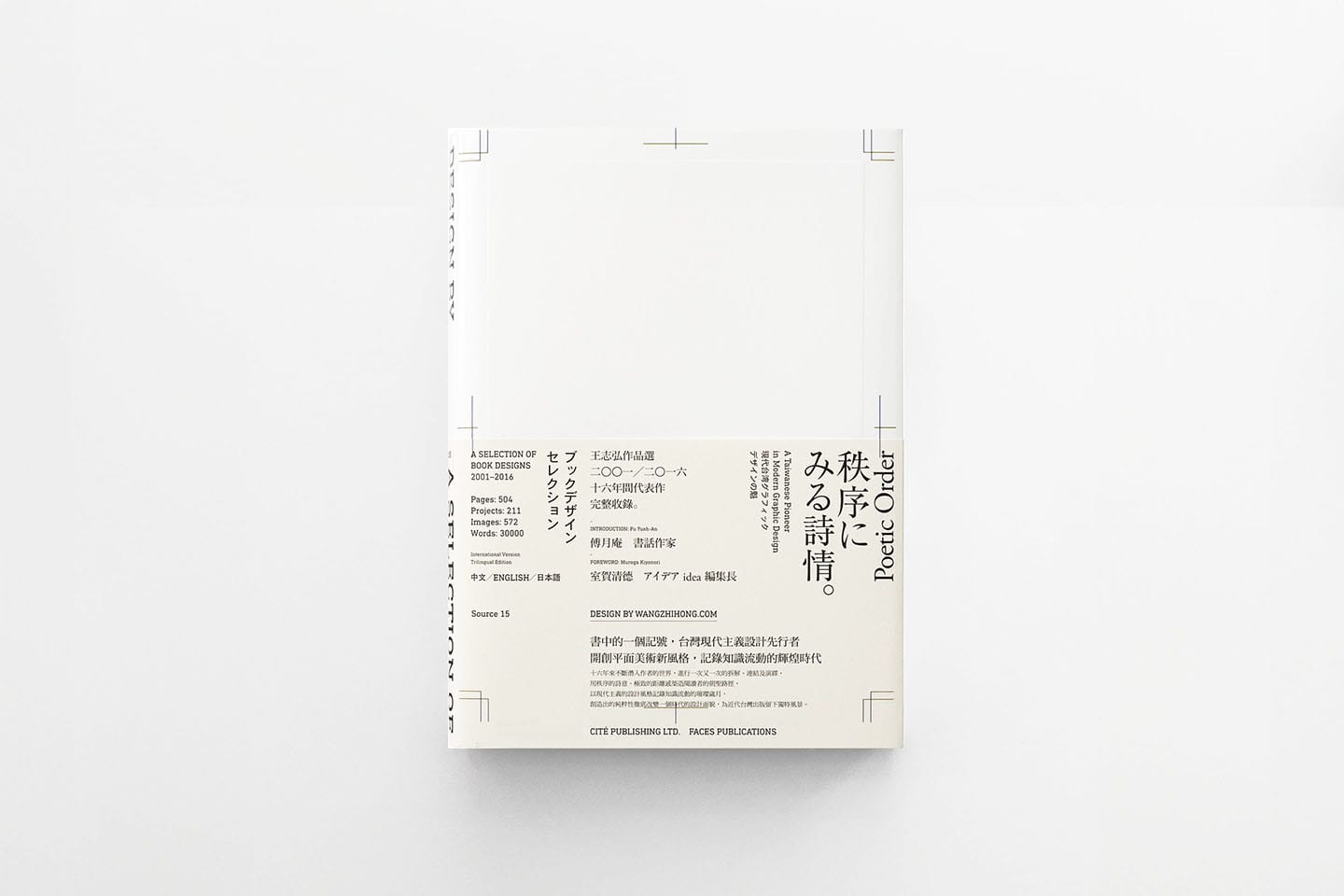
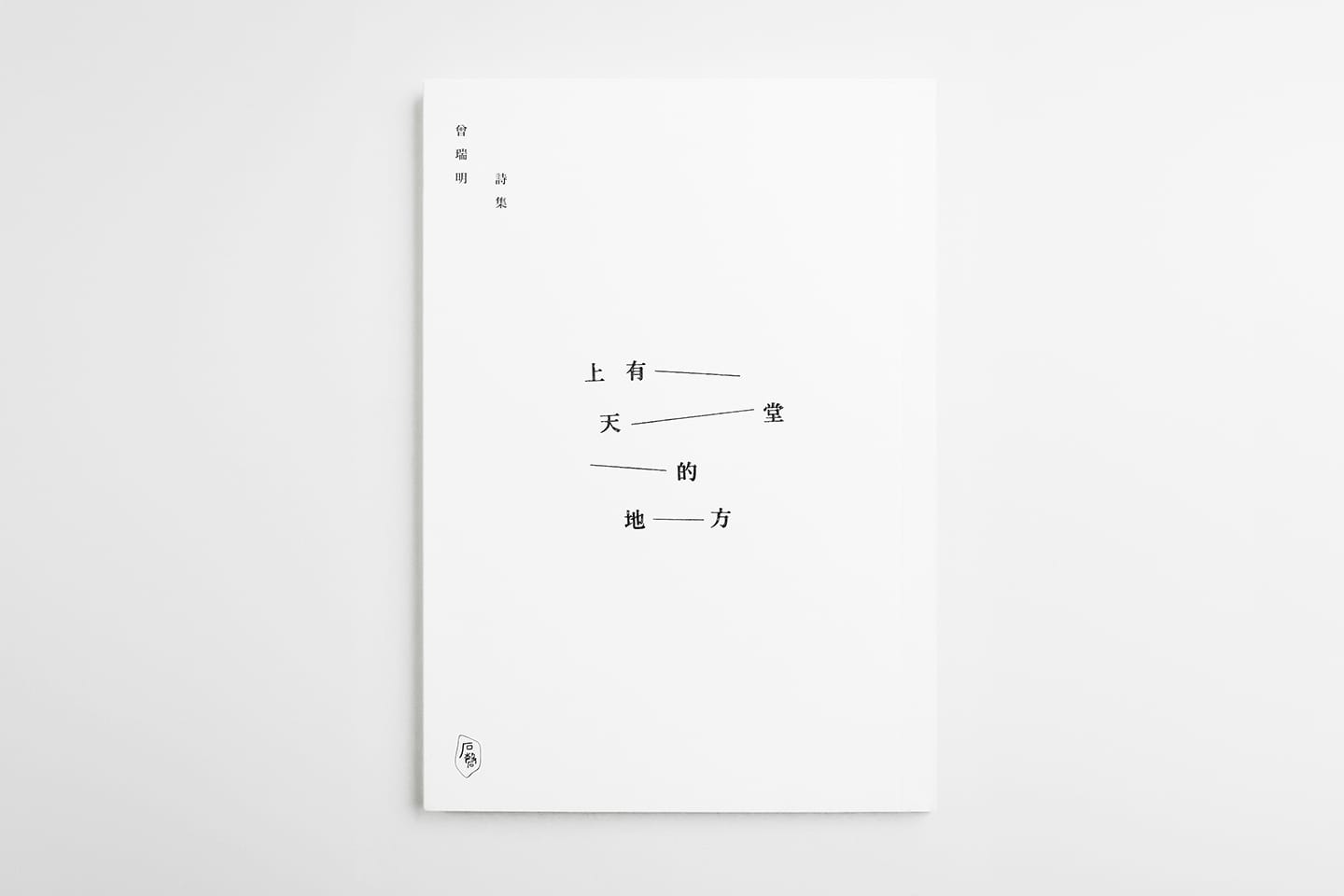
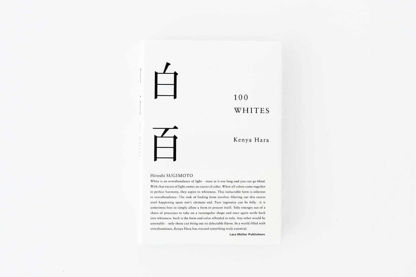
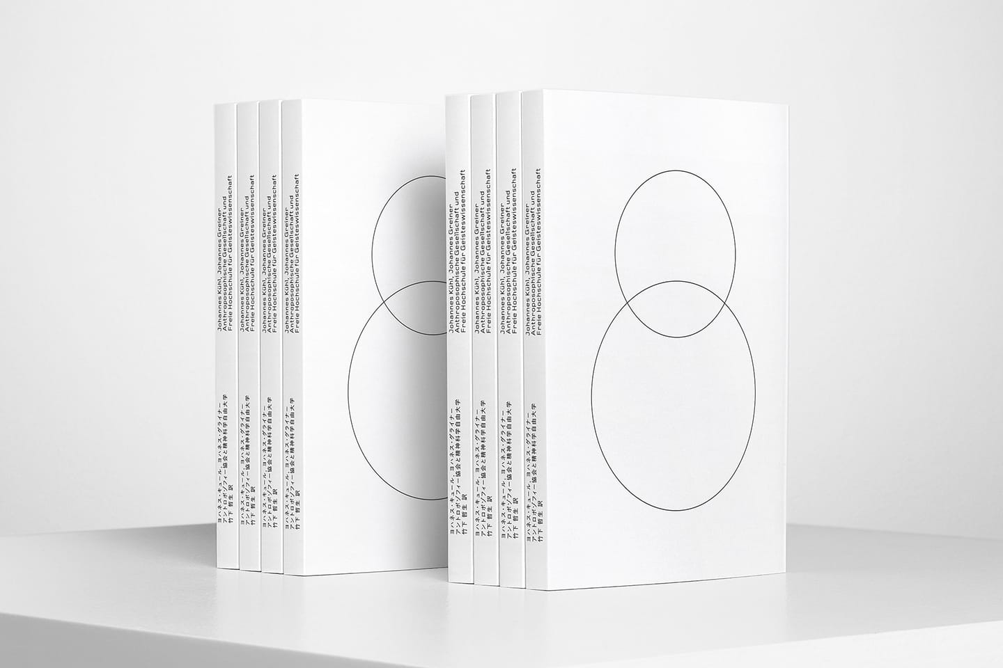
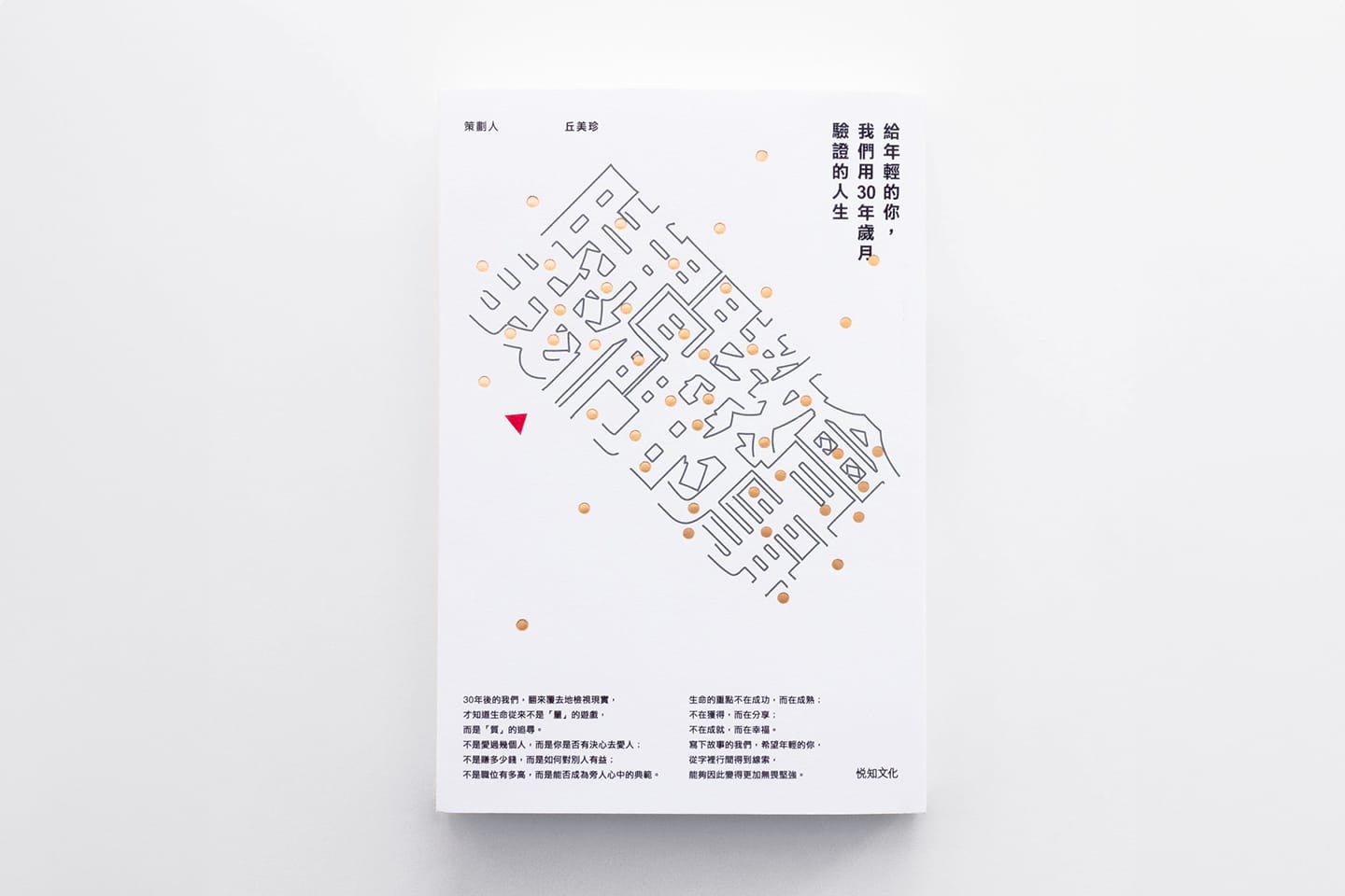
There is something very alluring, in particular, about the design of East Asian book covers that I can't quite put my finger on … The covers, often austere in appearance, are confident in their use of restraint, with whitespace adorned with well-considered marks of ink. Their colour is paired back, with one of two colours often the preference and their photography is artistic and subtle.
He then goes on to compare Western¹ book cover design:
Our designs in the West seem far more hectic, chaotic even. And as you trace back through the history of book cover design in the West, there's a sense that it's getting visually louder.
Dowling notes that as physical bookstores decline in the West, the battle for attention on the shelves intensifies, leading to an increasingly loud and competitive visual clash between covers.
The chaotic energy Dowling described was palpable as I stood in Daunt. Certain aspects of Japanese cover design would seem unthinkable in this environment—tiny typography, vast areas of negative space, covers without titles, perhaps adorned only by a geometric shape or a neat column of text. It’s a level of restraint rarely found in the UK market, where publishers’ fear of not standing out makes this kind of aesthetic nearly impossible.
Despite their immense skill and experience—and the eye-popping impact they achieve on the page—commercial book cover designers are tasked with the near-impossible job of driving sales in an overcrowded arena where everyone is using the same tactics.
In the Japan travel section, the visuals often reflect a distorted interpretation of Japanese aesthetics—a heavy-handed assemblage of sakura blossoms, Mount Fuji, brush script, and the bursting rays of the imperialistic Rising Sun flag, which some critics have called to ban, yet are used as a playful motif.
Japanese design is, of course, only sometimes synonymous with minimalism. Step into a branch of the electronics retailer Yodabashi Camera, and the sheer density of product advertisements and wall-to-wall campaign promotions is almost comical. Similarly, the visual pressure mounts in a typical bookshop within any central train station in Japan. Vibrantly coloured obi (帯) strips—narrow bands of paper wrapped around book covers—add layers of persuasive text, urging the hurried commuter to make a last-minute purchase before catching the shinkansen. Yet even in these settings, the merchandising has a sense of order and visual appeal.
The appeal might be aided by kanji and kana. The pictographic nature of kanji, paired with the simplicity of kana—both of which can be arranged left-to-right, right-to-left, or top-to-bottom—could be said to allow book cover designers to rely less heavily on striking imagery. A similar dynamic can be observed in Korean bookshops, where the geometric shapes of modern Hangul script carry the visual burden, and in China, where the grid-like structure of hanzi characters creates infinitely modular configurations.
Designing with East Asian inspiration while using Roman script often feels like an exercise in futility. This helps explain the recent trend of album covers, t-shirts, and products adorned with Japanese characters. A British band's latest album may have no thematic connection to Japan and might not ever be destined for the Japanese market. Yet, the designer seeks to tap into that aesthetic world by setting the band's name in katakana in the lower right-hand corner.
Returning to the Japanese railway station bookshop, I'm also enamoured by the tactile experience, where specific book sizes offer a pleasing "holdability," regardless of the quality of their graphic design. The bunkoban (文庫本) size, at 105 x 148 mm—the equivalent of ISO A6—is typical for novels, short stories, and classic literature. Meanwhile, a more informational book featuring images and varied layouts might take the form of the Japan Industrial Standards (JIS) B6 size at 125 x 176 mm. Shinshoban (新書判), measuring 106 x 173 mm, is another highly appealing size—slim, portable, and sleek—striking the perfect balance between readability and compactness.
These dimensions are typically paired with lightweight covers wrapped in soft, glossy jackets that gently hug the bound pages, with forgiving rounded edges. The size, weight, and texture combine to create an understated luxury. Manga tankobon (単行本) volumes can be found in any of these sizes. Still, this satisfying format often gets lost in translation, with English editions frequently appearing in the comparatively bland ISO A5 size.
Besides consumer paperbacks, English-language art and design publications constantly pursue higher ideals, treating the book as an art object. The bookshops of the Design Museum on High Street Kensington or the ICA Bookstore on The Mall in London reflect this intellectual and creative approach. Yet, in The Form of the Book, a collection of essays curated by Sara De Bondt and Fraser Muggeridge, several contributors highlight a common issue in this niche of book design. James Goggin points out that many designers cannot resist the urge to "compete with the artist," resulting in visually rich but unwieldy publications
Richard Hollis, drawing on Gyorgy Kepes, encapsulates this tension. In a 1948 publication by Harvard University Press, Kepes asserted:
A book has weight, size, thickness and tactile qualities which are handled by the hand, as its optical form is handled by the eye … The book can be conceived of in the same sense as the handle of a tool or a utensil.
Hollis observes that Kepes would likely be astonished by how today's designers have let these characteristics overshadow the reading experience.
As I work on my book's digital presentation, I can set aside these tactile concerns for now. Yet even in the digital space, where covers are reduced to thumbnails, the tension between imagery and legibility remains. Jon Dowling proposes that as book covers now appear alongside the title and author’s name in eBook marketplaces, a return to pure image-making is once again possible. While this may be true in some cases, I’ve noticed that many publishers have instead responded by making titles and logos even larger, anxiously emphasising them despite their already prominent display in clickable text alongside the cover.
This week, I had to hold myself back from writing an entire treatise on the vast array of Japanese paper sizes or going deeper into the rich history of CD rental in 1990s Japan. But, as you might expect, I'm short on time again, caught up in the world of aesthetic choices—balancing the need to make my book cover stand out without shouting; to channel the creativity found on the shelves of gallery book shops without losing sight of functionality; to imbue it with the appeal of Japanese design, creating something that conveys the essence of Tokyo without falling into clichés.
As I return to my InDesign artboards, I'll leave you with some minimal book covers by East Asian designers. While the marketing departments of many publishing houses may fear they would never sell, Daikanyama T-Site might suggest otherwise.
Until we meet in a library in the woods,
AJ
Links
Book Cover Design from East Asia
The Form of the Book
Footnotes
¹ While I don't typically use the "Western" construct, I’ve adhered to it here to remain consistent with the cited author.