The International Space Station (ISS) orbits Earth at an altitude of approximately 400 kilometres, completing a full circuit of the planet every 90 minutes. This expansive, habitable satellite—developed through the collaboration of the United States, Canada, Europe, Russia, and Japan—houses Kibō (きぼう), meaning hope, Japan’s dedicated experiment module. Kibō, designed and operated by the Japan Aerospace Exploration Agency (JAXA), serves as the nation’s primary spaceborne research facility.
The module's pressurised unit, measuring approximately 11 × 4 metres, is a dense network of wires and dials. At its entrance hangs a vivid indigo fabric divider, split into three panels, each bearing one of three hiragana characters spelling its name. Since the facility's activation in June 2008, the divider has become an enduring symbol of Japan’s presence aboard the station. It delineates the threshold between Kibō’s workspace and the rest of the ISS while also carrying the honour of representing Japanese culture in space. Although its role is significant, it remains a humble noren (暖簾).
Kibō’s noren performs a dual function as a spatial partition and a cultural emblem, mirroring the work of its counterparts down on planet Earth. Across Japan, noren drape shop entrances, acting as business signs dyed with a shop’s name, logo, or kamon (家紋) family crest, while also offering privacy and delineation. These fabric panels hang freely from a bamboo rod, fastened either by chichi (乳) loops—the traditional Kanto region design—or a more discreet, tube-like sleeve, historically seen in Kansai. When caught by a breeze, they shift and sway, fluttering or dancing.
In the microgravity environment aboard the ISS, there is no air movement to hold the noren in place, so it must be clamped on either side to prevent it from floating. Kibō’s noren has remained fixed in place for 17 years—an uninterrupted span unheard of on earth. Noren are usually hung at the start of business to indicate an establishment is open and taken down each day at closing, doubling as an “open closed” sign. In the early evening or the late hours, a noren may be seen slung up over its rod, loosely knotted, or with a corner folded and tucked away—a signal that the shop is closed to customers, yet within, the staff remain, preparing for service or finishing up for the night.
JAXA also has a branded noren on duty at X-NIHONBASHI, a business hub for the space industry managed by the agency. The design features Kibō’s round observation window at its centre, a nod to the circular form of kamon crests, which traditionally depict natural motifs like wisteria, cranes, or waves. Rather than an earthly emblem, however, JAXA’s noren offers a portal to the cosmos, simulating the view from the space station itself.
Masayoshi Boku, founder and creative director of the Tokyo-based design studio Bascule, recalls his brief from JAXA: how to make space feel more connected to everyday life. “Most people perceive space as distant and inaccessible,” he notes, “yet space exploration is deeply intertwined with life on Earth.” This is where noren come in conceptually. Boku describes them as “a symbolic threshold that could bridge the gap between Earth and space.” In his view, a noren is not a barrier but an open invitation.
In conversation with esteemed noren maker Shin Nakamura, architect Kengo Kuma explores a similar idea, remarking, “Noren is nothing like a curtain—it is far more fluid.” Kuma observes that Western design tends to follow a rigid hierarchy, with cities, buildings, furniture, and signage each occupying distinct, well-defined roles. Noren, however, defy such categorisation. They exist at the crossroads of architecture, product design, and signage. It is difficult to determine whether a noren belongs to interior decor or the urban landscape, much like engawa (縁側) verandas and shōji (障子) sliding doors—elements that dissolve the boundary between inside and outside.
Reflecting on his work at the Hotel Royal Classic Osaka, Kuma recalls a moment during the final inspection when a heavy iron door unsettled the harmony of the space. To resolve this, he enlisted Nakamura, who used the traditional suminagashi (墨流し) ink marbling technique to dye a noren that would conceal the door. What had once felt rigid and imposing was transformed into the room’s most elegant feature. Kuma describes the shift: the instant the noren was introduced, the hotel’s entire ambience softened. “That’s the unique power of noren,” he remarks. “It can transform a space instantly.”
This soft, atmospheric quality has always defined my impression of noren—not from an encounter in a four-star hotel like the Royal Classic Osaka, but from wandering the side streets of Tokyo. Just as noren recalibrate interiors, they also lend the streetscape their elegance. Picture a crisp white noren drifting in the breeze at an intersection, framed by dark wooden panelling against the concrete facade of an office building deep within the city. It would be tempting to describe the scene as “Zen,” a term frequently used loosely in English, decoupled from its Buddhist origins.
Yet, in the case of noren, the connection is indeed historical, as the word is believed to have originated from Chinese Buddhist texts. The Chìxiū Bǎizhàng Qīnggu (勅修百丈清規), a monastic rulebook introduced to Japan during the late Kamakura Period (1192–1333), describes fabric coverings draped over reed blinds in Zen temples, shielding interiors from sunlight and dust. Known in Chinese as nuǎn lián (暖簾), these coverings were later adapted into Japanese as nōnren, eventually evolving into the modern noren (のれん).
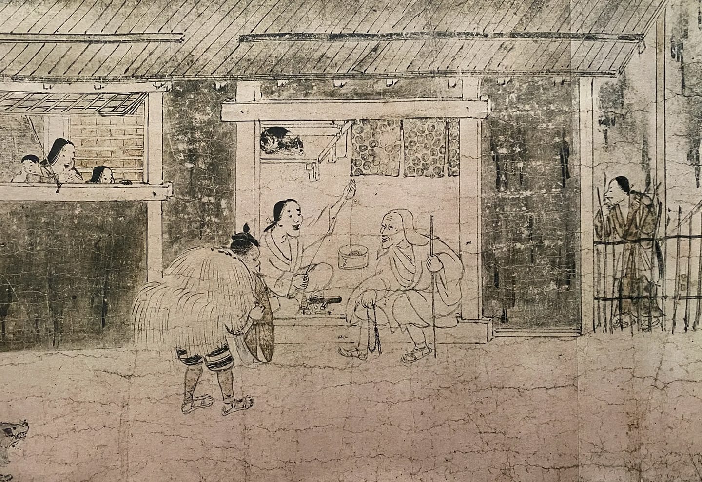
While this is the accepted etymology, noren is not an adapted cultural property. Prior to the influence of Chinese Buddhism, the earliest known visual depiction of noren appears in the Shigisan Engi Emaki (信貴山縁起絵巻), a picture scroll from the late Heian Period (794–1185), where a half-length noren hangs at the entrance of a house. Heian literature further suggests that Japan had its own tradition of hanging fabrics. Texts such as The Tale of Genji mention hō (幌), tobari (帳), maku (幕), and misu (簾)—each serving a similar function of providing shade or privacy.

To trace the evolution of noren in the urban landscape, scholar of Japanese literature Robert Campbell, Ph.D., takes us back to the Edo Period (1603–1868). He points out that illustrated scrolls and woodblock prints from the era consistently depict noren as an integral part of the city’s streetscape—lining shopfronts and forming a rhythmic visual continuity. Campbell suggests that noren played a vital role in urban navigation, enabling passersby to instantly identify a shop, even if they were unfamiliar with the neighbourhood.
In 1872, during the early Meiji Era (1869–1912), a fire tore through central Tokyo, reducing much of Ginza to ashes. In its aftermath, the Japanese government acquired the land and developed Ginza Bricktown—a carefully planned, fire-resistant urban district. It featured a striking new architectural aesthetic in contrast to the wooden structures of the surrounding Edo neighbourhoods. Ginza’s main avenue, flanked by European-style colonnades, looked as if a Western provincial city had been transplanted into Japan.
An unanticipated fusion emerged as merchants in the newly built brick structures began draping noren over the colonnades. Western-style storefronts required customers to push open doors and step inside—an unfamiliar retail experience for Edo merchants accustomed to open-fronted shops. To maintain the flow of Japanese street commerce, shop owners instinctively adjusted, continuing to hang noren over their entrances as they always had.
It will have created a vibrant streetscape—at the time, each noren’s colour still indicated the nature of a business, gradually taking on broader symbolic meanings. Early dyeing techniques were limited, leading to overlapping categories rather than a neat colour code. Today, noren can be created in any imaginable hue or pattern, yet businesses with a reverence for tradition—or those wishing to incorporate historical elements into modern designs—continue to draw inspiration from these time-honoured colourways.
- Indigo & Navy (藍染・紺色, Aizome / Kon-iro) – Traditionally used by sake breweries, kimono shops, and general merchants. The sukumo (すくも) fermentation dyeing process endowed it with antibacterial and insect-repelling properties, making it both highly functional and prestigious.
- Persimmon (柿色, Kaki-iro) – Originally exclusive to high-class geisha houses, high-end restaurants later adopted it. Achieved through kakishibu (柿渋) persimmon dyeing, its reddish orange hue evoked refinement and exclusivity.
- White (白色, Shiro-iro) – A preferred choice for confectioners, restaurants, and pharmacies, white noren in Edo-period Japan conveyed purity and excellence. The association was especially strong with sugar—an expensive luxury at the time—further reinforcing its symbolism of refinement and quality.
- Brown (茶色・黄土色, Cha-iro / Ōdo-iro) – Popular among tobacco sellers, medicine shops, and seed merchants. Shibuzome (渋染め) tannin dyeing and dorozome (泥染め) mud dyeing produced the earthy, yellow-brown hues commonly seen on the noren of Edo-period tobacco vendors.
- Purple (紫色, Murasaki-iro) – Once reserved for nobility, purple noren later became a financial marker. Banks and moneylenders were required to display them until debts were repaid. The shikon-zome (紫根染め) process, which utilised gromwell root, made it a rare and luxurious dye.
If you’ve visited an onsen (温泉) or sentō (銭湯) bath, you will already be familiar with the distinctive use of coloured noren at their entrances. These fabric dividers are often marked with "ゆ" (yu, meaning hot water) or signs reading "男湯" (otoko-yu, men’s bath) in blue and "女湯" (onna-yu, women’s bath) in red. They produce a feeling of privacy beyond the threshold and act as a gentle reminder of the gender division while also contributing to the overall aesthetic of the bathhouse.
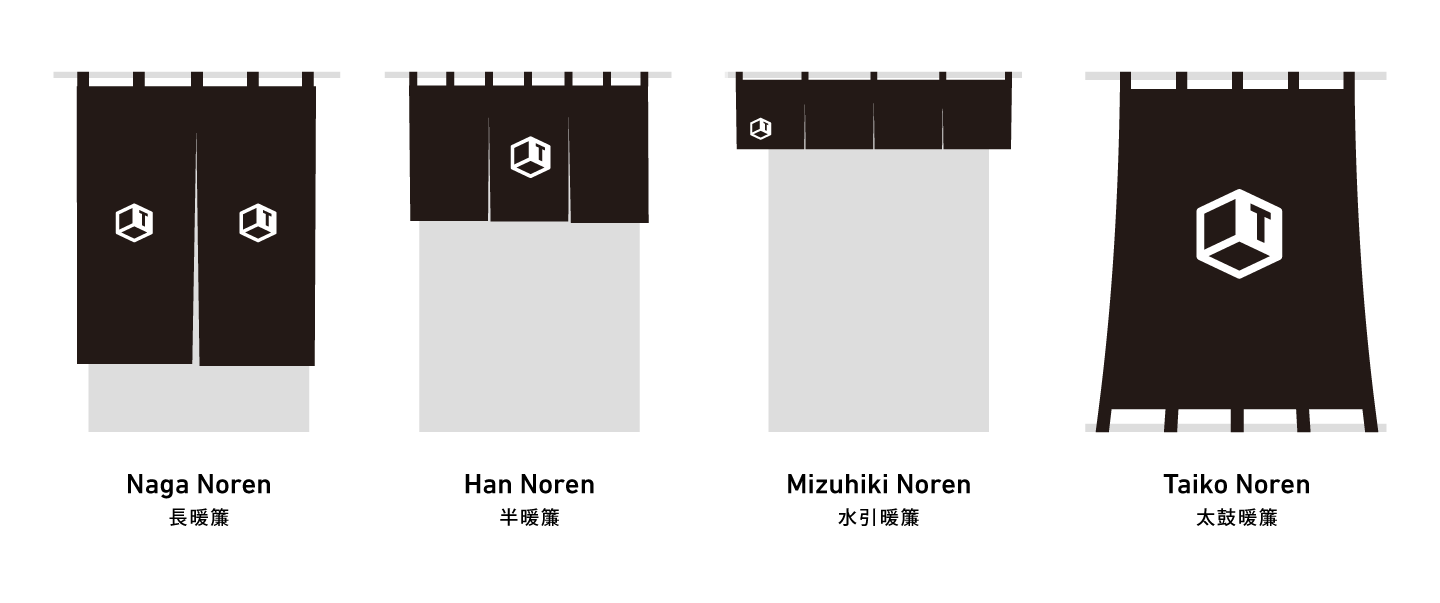
Noren evolved in form as well as colour, gradually refining into a core set of styles—each of which can still be encountered while wandering through contemporary urban Japan.

- Long Noren (長暖簾, Naga Noren) – Hanging low, nearly reaching the ground, this type offers shade, privacy, and signage.
- Half Noren (半暖簾, Han Noren) – A shorter style that allows passersby to glimpse inside; a staple in sushi, soba, and udon restaurants.
- Waterfall Noren (水引暖簾, Mizuhiki Noren) – The most minimal form, draped only at the top of an entrance. Often left out overnight, it signals a business of permanence.
- Taiko Noren (太鼓暖簾, Taiko Noren) – A single, uncut fabric panel stretched outward from a storefront, creating a drum-like movement in the wind. Once widespread in Edo, but a rarity in Kyoto.
In addition to soft fabrics, there are also:
- Rope Noren (縄暖簾, Nawa Noren) – Woven from natural fibres instead of fabric, these noren were historically favoured by izakaya and taverns.
- Beaded Noren (珠暖簾, Tama Noren) – Strands of wood, glass, or bamboo beads commonly found in private homes and tea shops. The 1960s saw a proliferation of these designs, now nostalgically categorised as Shōwa Retro.
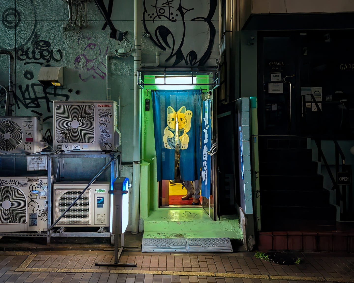
I find myself particularly drawn to naga noren. While Masayoshi Boku places noren as an open invitation, a naga noren—covering an entrance almost entirely—introduces an element of mystery. Combined with frosted glass, tightly latticed wood, and perhaps nothing more than a discreetly hand-painted kanji, they veil the interior, leaving little indication of what lies beyond. To part the fabric, slide open the door, and step inside requires a minor act of courage. Japanese patrons and foreigners describe a sense of apprehension in these moments. This hesitation might deepen for the foreigner—layered with the uncertainty of language barriers, etiquette, and the fear of intruding upon an unfamiliar space.
If this sensation feels familiar—if, in those moments, you’ve ever felt that you were encountering more than a simple fabric divider or piece of signage—you wouldn’t be wrong. The symbolic weight of noren runs deeper still, shaping language and tradition in ways that extend beyond their physical presence.
Take, for instance, the phrase noren o mamoru (のれんを守る), or “protecting the noren”—a concept tied to upholding a shop’s reputation, craftsmanship, and business ethics. Conversely, noren ni kizu ga tsuku (暖簾に傷が付く), meaning “to wound the noren,” signifies reputational damage. And should that wound prove irreparable, one may be forced to take down the noren—noren o orosu (暖簾を下ろす)—a phrase that marks the finality of closing a business for good.
On the other hand, a well-worn noren was once a sign of healthy footfall. Before World War II, it was customary for customers to wipe their hands on the noren as they left—meaning the more marks it bore, the more people had passed through. And when an apprentice or long-term employee of a successful business was ready to open their own shop, their former master might grant them permission to use the business name and mark, a practice ceremoniously known as noren wake (暖簾分け)—"splitting the noren". It symbolized a transfer of legacy, skills, and reputation, giving the new business a head start and demonstrating a continued link to the original establishment.
This connects to a practice that persists today, where the concept of noren extends into accounting and legal contexts. In this realm, the term refers to intangible assets such as brand reputation and customer loyalty. It is prominent in Japanese mergers and acquisitions, where noren denotes the gap between a company’s purchase price and the market value of its net assets. The surplus is recorded as a noren fee if the acquisition cost exceeds this value.
In all these ways, noren are more than fabric; they simultaneously serve as coded language, historical markers, and architectural elements. Today’s meditation on noren leads me to reflect on my own feelings toward these venerable dividers. I love their visual lexicon—the reassurance of spotting the blue han noren of a Shōwa-era soba shop, signalling it is still open, or the regal presence of a billowing purple taiko noren adorning a century-old Ginza confectioner. Whether framing the entrance of time-honoured establishments like these or marking the threshold of a JAXA research lab in orbit, noren continue to communicate identity and meaning.
Yet, as I wander Tokyo at night, I find myself most drawn to what a noren conceals rather than what it reveals. In some quiet recess of the metropolis, a noren dances in the breeze, shrouding human activity within spaces of uncertain purpose, frequented by unseen patrons, engaged in business not entirely known. The triumph lies in crossing the threshold. This pursuit of the obscured is one dragon I will never stop chasing.
Until we meet behind the noren,
AJ
Tokyothèque is funded by readers like yourself, allowing me to explore in depth lesser-covered topics—like the fabric dividers that flutter on city streets. I aspire to an open-access model, where everyone receives a weekly newsletter, regardless of their ability to pay, while I earn a living by bringing it to you.
So, if the newsletter deepens your understanding of Japan, inspires your travels, or provides a moment's solace as you recover from the week's demands—whatever keeps you reading—please consider supporting the project through membership. You'll also gain access to a few perks upon joining, which you can find at the link below.
Thank you for your continued readership.
